PERIOD.
Duration: 4 Weeks
Domain: Branding, Packaging Design
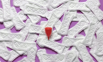
PERIOD. is a research-led branding and packaging project for a reusable menstrual cup.
Although menstrual cups are one of the most sustainable menstrual hygiene solutions available today, adoption remains low. The hesitation is not about the product’s effectiveness, but about how it is introduced and understood.
This project explores how packaging can function as the first point of education. Instead of acting as a container alone, it becomes a structured communication system that informs, reassures, and empowers.

What The Research Revealed
• Menstruation is still considered taboo by many users
• Menstrual cups are often perceived as suitable only for married women
• Users prefer aesthetically pleasing packaging but expect clear information
• Existing packaging lacks adequate guidance on usage and insertion
• Users often rely on external videos due to insufficient instructions
Core Problems Identified
• Social stigma around menstruation and menstrual cups
• Misinformation and a lack of open discussion
• Packaging that prioritises aesthetics over education
• Poorly designed instruction leaflets
• Packaging that users do not want to retain for long-term use
Why do people hesitate to adopt menstrual cups even when they want to?
The answer is lack of structured onboarding, emotional hesitation and poor communication design

What does an onboarding system for menstrual cups look like now?


Final Packaging Design
Box with reusable structure. Colour-coded sizes (Small, Medium, Large). Warm gradients paired with a strong purple base. Clear size differentiation and product information. Packaging balances emotional warmth with functional clarity.


What I Learnt
This project taught me how packaging can act as a powerful communication tool, not only selling a product, but shaping perception, behaviour, and social attitudes. Designing PERIOD. strengthened my understanding of how visual systems can challenge taboos and promote sustainable change.


